Build a Linear Regression Model
Is there a relationship between humidity and temperature? What about between humidity and apparent temperature? Can you predict the apparent temperature given the humidity?

This article is a quick guide to build a Linear Regression Model. Here I will be using the weather dataset that is taken from Kaggle. This article outline as follows.
Prerequisites
In this article, I will not focus on explaining the machine learning theoretical side and their mathematical and statistical background. I assume that you are aware of it. Here, Actually, I will be focusing on the guide step by step to develop a best-suited Linear Regression model. But, If you don’t have much theoretical and mathematical background, Don’t worry. I will explain the fundamental concepts behind the Linear Regression Model briefly in this article. And also, to build this linear regression model I used python language. If you do not familiar with Python very much, I recommended following this Python Course.
This article outline as follows,
Outline
- What is Linear Regression?
- Domain Knowlege on Weather Information
- Overview of Dataset
- Pre-processing
- Perform Feature Engineering
- Build a Linear Regression Model
- Model Evaluation
- Summary
What is Linear Regression?
Linear regression is a method of modeling the connection between a target variable that is called y or dependent variable and one or more explanatory factors that is called features or independent variables. The general form of linear regression as follows.

Y is the target variable we want to predict or estimate. X variables are the features of our model. So we try to build a linear relation between we identified significant features. W values are the coefficients added to build the linear relationship with the target variable and our features. It’s simple and it is formed of y = mx + c equation.
Domain Knowledge on Weather Information
I guess you have already seen my subtitle. It is “Is there a relationship between humidity and temperature? What about between humidity and apparent temperature? Can you predict the apparent temperature given the humidity?”. This is the use-case for our linear regression model. Actually here, we will do an analysis of the relationship between humidity and temperature and also the relationship between apparent temperature and humidity. The purpose of building a linear regression model to check whether the humidity is enough to predict apparent temperature. Before that let’s define apparent temperature and humidity. Apparent temperature is the temperature equivalent perceived by humans and Humidity is the amount of water vapor in the air. So in a general context, we know humidity inversely proportional to the temperature. Let’s see it and summarize it after building your regression model.
Overview of Dataset
Figure 1 shows you our dataset which is taken from Kaggle. There are 12 columns in our dataset. Although, there is a column called Daily Summary that is derived from the Summary column. So, we can drop that column using the pandas library drop method. And also, here I will not consider a column called Formatted Date. Because In this article not focus on time series analysis. So, before we start we can drop both Daily Summary and Formatted Date column. Don’t worry about codes. I have been linked Python Notebook to this article. So, you can refer to that for codes. Now, we have 10 columns. two columns are categorical features and the other 8 columns are numerical features. And also you can see our target variable that is called y is also in the dataset. It is Apparent Temperature.

Now, we have an idea about what we going to do. So, let’s start our first step is pre-processing your data.
Pre-processing
Pre-processing is a crucial step when creating learning models. Because it will directly affect the model accuracy and qualify of output. Actually, this is a time-consuming event. but we need to do it for better performance. I will be following four steps in pre-processing.
- Handling Missing Values
- Handling Outliers
- Feature Transformations
- Feature Coding
- Feature Scaling
- Feature Discretization
Handling Missing Values

Figure 2 shows you the column vs null value availability. True indicates there if null values are available. So, we found a column that is called Precip Type and it has null values. 0.00536% null data points there and is very smaller when comparing with our dataset. Since we can drop all null values.
Handling Outliers
I would like to suggest further studying regarding handling outlier values using this article Handling Outlier Values.
The next step is handling outliers. We only do outlier handling for only continuous variables. Because continuous variables have a big range when compare to categorical variables. So, let’s describe our data using the pandas describe the method. Figure 3 shows a description of our variables. You can see the Loud Cover column min and max values are zeros. So, that’s mean it always zero. Since we can drop the Loud Cover column before starting the outlier handling
Describe Data

We can perform outlier handling using boxplots and percentiles. As a first step, we can plot a boxplot for all the variables and check whether for any outliers. We can see Pressure, Temperature, Apparent Temperature, Humidity, and Wind Speed variables have outliers in the boxplot that is figure 4. But that does not mean all outlier points should be removed. Those points also help to capture and generalize our pattern which we going to recognize. So, first, we can check the number of outliers points for each column and get an idea about how much weight have for outliers as a figure.

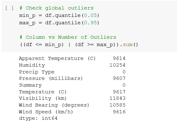
As we can see from figure 5, there are a considerable amount of outliers for our model when using percentile between 0.05 and 0.95. So, it is not a good idea to remove all as global outliers. Since those values also help to identify the pattern and the performance will be increased. Although, here we can check for any anomalies from the outliers when compared to the other outliers in a column and also contextual outliers. Since, In a general context, pressure millibars lie between 100–1050, So, we can remove all values that out from this range.

Figure 6 shows you after removing outliers in the Pressure column. 288 rows deleted by the Pressure (millibars) feature contextual outlier handling. So, that amount is not very much big when comparing our dataset. Since simply it is okay to delete and continue. But, note that if our operation affected by many rows then we have to apply different techniques such as replacing outliers with min and max values without removing them.
I will not show all the outlier handling in this article. You can see it in my Python Notebook and now we can move to the next step.
Feature Transformations
We always prefer if your features values from a normal distribution. Because then it is easy to perform the learning process well for the model. So, here we will basically try to convert skewed features to a normal distribution as we much can do. We can use histograms and Q-Q Plots to visualize and identify skewness.

Figure 7 shows you, the histogram for the Temperature column and we can take it as systematic distribution.

Figure 8 shows you Q-Q Plot for Temperature. The red line is the expected normal distribution for Temperature. The blue color line represents the actual distribution. So here, most of the distribution points lie on the red line or expected normal distribution line. Since, no need to transform the Temperature feature. Because it does not has long-tail or skewness.
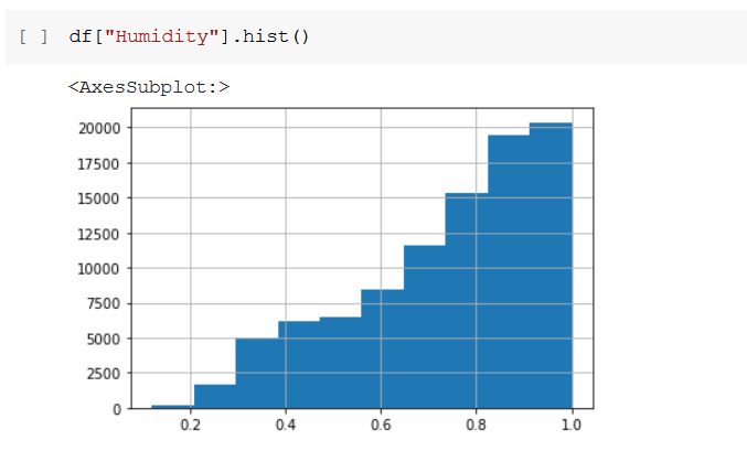
Figure 9 shows you, the histogram for humidity and it clearly shows there is a left skewness. The histogram feature needs to transform for normal distribution.
In figure 10, also you can clearly see humidity distribution blue color line falls down when the gradient increasing. So, as per both histograms and Q-Q Plot, we can now decide which transformation is very suitable for Humidity feature transformation for normal distribution.

In the general context, we apply exponential transformation for left skewness and logarithmic or sqrt transformation for right skewness transformation. So, here we need to apply exponential for the Humidity feature.
Before applying transformations, we need to split the dataset into training and testing data. Otherwise, data leakage will happen. It simply means our model will be seen in the testing data during when training phase. If we perform for transformation for all data without splitting then when training phase and testing phase our model will be performed well. But, when working in the real world we may be losing our model’s performance. So, from here onwards I will be using training and testing data separately. Figure 11 shows you how to split our dataset. and note that there is an important technical fact after split our dataset. It is, we need to reset our X_train, X_test, y_train, y_test indexes. Otherwise, we can expect misbehaves when continuing.

Figure 12 shows you how to apply exponential transformation for the Humidity column.

Figure 13 shows you the histogram after applying exponential transformation for the Humidity column and figure 14 shows you Q-Q Plot after applying the transformation. So, we can clearly see Humidity feature skewness is reduced.


Refer to Python Notebook for the other feature transformations.
The next step is feature coding.
Feature Coding
Feature Coding refers to convert text or labels to numerical data. Because our neural network learning algorithms work only numerical data.
I will recommend reading more about feature coding using this article Feature Coding.
Now, it‘s time to do feature coding. before feature coding, we need to identify what features need feature coding. So, this weather dataset has Precip Type and Summary column that has categorical labels.
We can use label encoding for Precip Type because it having only 2 types of values. Figure 15 shows you how to do label encoding for Precip Type categorical feature.

The summary column has 26 unique labels or values. So, in the general context, it is recommended to apply one-hot encoding. Because if we apply the label encoding technique some of the categorical variables get higher weights, and the model also gets unnecessary weights for our predictions. and our algorithm may be lead to think there is rank or precedence with categorical values. But, in this context, I will apply label encoding for the summary feature. The reason is that the summary feature is derived from all of the other attributes. So, we can show that the summary feature does not require for our model. I will show it to you in the feature engineering section. You can see label encoding for the Summary column in my notebook.

Figure 16 shows you our data frame after applying feature coding techniques.
Feature Scaling
Feature scaling refers to the methods used to normalize a large range of values. This is a necessary step. Because this step directly influences the regression coefficient values. And also, Learning is also faster when features are on similar scales. There are so many feature scaling techniques. But here we will be applying standardization as the following equation.
X_hat = (X — mean(X)) / std(X)
Now, before feature scaling, we need to remove all categorical features and do feature scaling. Figure 16 shows you how to do feature scaling and after feature scaling how our data frame look likes.

After standardizing
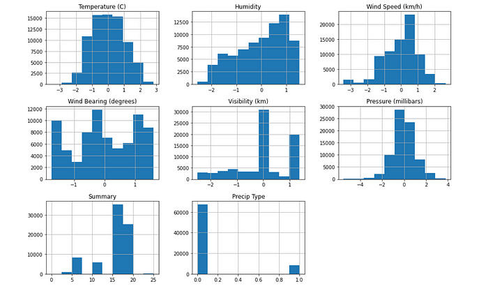
Figure 18 shows you after standardizing, how our data look likes in histograms. Now, we can see all continuous features scaled up to the same scale.
Feature Discretization
Feature Discretization is the process of dividing continuous variable features into a range of groups or bins. This process does if features have a big range of values. Actually, this will reduce unnecessary weight will gain from the feature that has a big range of values.
I recommend this article to read for more about Feature Discretization.
In our context, wind bearing or wind speed has a big range of values when compared to the others. It varies from 0–360. So, we can divide this into 8 bins by assuming main wind directions such as North (N), North-East (NE), West (W), etc. Figure 19 shows you how to do it using KBinsDiscretizer in coding level and figure 20 and 21 show you after applying discretization how our Wind Bearing feature look likes. Now, we have only 8 values in the Wind Speed feature that are scaled from 1 to 8.


Now, Pre-processing steps are completed and the next step is performing Feature Engineering.
Perform Feature engineering
Feature engineering simply refers to selecting features which significant for our model. Identifying highly correlated features for our target has a huge impact on our model performance. I have seen most of the guys skip this step and continuing with all columns without knowing how much each features significant for our target. But, if you skip this step your model complexity will be increase. and our model tries to capture all noise as well. So, it will lead to overfitted during training and some times testing phase. So, the Model may be failed to generalize the real-world data pattern.
First, we should identify dependent and independent features using heatmap for continuous feature values. Figure 22 shows you, heatmap for features.

If the correlation between two features is near +1, then, there is a strong positive correlation and we can conclude that the two features are dependent on each other. If the correlation between two features is near -1, then, there is a strong negative correlation between two features, and those two features also dependent on each other. If the correlation between two features is near 0, then we can conclude both features do not depend on each other. So, here in our context, It seems all features can be assumed as independent. Because there is no strong correlation between any two features. But, there is a considerable amount of negative correlation between humidity and temperature. It is nearly -0.6. Although it has not a very much strong relationship between humidity and temperature. So, we don't want to remove one feature from the humidity and temperature. Because it helps to reduce our bias or intercept value and increase variance.
Next, we can check the significance of each continuous value feature with our target variable y that is apparent temperature. Figure 23 shows you, heatmap to check the significance of our target variables.

From the above heatmap, we can list the significant features for our target variable Apparent Temperature as follows,
Significant Features
- Temperature
- Visibility (km)
- Humidity
- Precip Type
- Pressure (millibars) — this has a low significance level but we can consider it also for our model.
Now we have identified five (5) significant features that have a considerable amount of correlation with our target variable. So, we can drop the rest of the columns and continue with identified significant features.
We have now 5 features both continuous and categorical. If we consider all of 5 features then our model complexity may be high and also our model may be get overfitted. So, we can easily apply PCA to dimensionality reduction further. Then it helps to generalize our model for real-world data.
Let’s Apply PCA
PCA is an algorithm that can be used to reduce our dimensions in our model.
Note that, PCA does not eliminate redundant features, it creates a new set of features that is a linear combination of the input features and it will map into an eigenvector. Those variables called principal components and all PC are orthogonal to each other. Hence, it avoids redundant information. To select features it will we use the eigenvalues in the eigenvector and we can choose features that have achieved 95% of covariance using eigenvalues.
You can read about PCA further using this PCA article.
Figure 24 shows you, Covariance of all 5 features. It is recommended to take a number of components that have greater than a total of 95% of covariance for our model.


Figure 25 shows you 98.5% of covariance can be taken from the first 44 components. So, We need 4 components to achieve 95% of the covariance for our model and the other component only achieved nearly 1.5% of covariance. But, don’t take all features to increase accuracy. If you take all features your model maybe get overfitted and will be failed on when performing in real. And also, if you reduce the number of components, then you will get less amount of covariance, and the model can be under-fitted. So, now we reduced our model dimensions from 5 to 4 here.
Next, we can define PCA with 4 components as figure 26. So, it basically reduced our X_train and X_test frame to 4 dimensions.
Init PCA with 4 compoents

Now we have completed feature engineering. Now its’s time to build our linear regression model.
Build a Linear Regression Model
Fit the model

Figure 27 shows you how to build a linear regression model by using sklearn linear_model and the first 5 predicted values in the test data set.
Note that, remember to use X_train_pca that is the training data frame taken from after applying PCA to fit the model. When predicting also remember to use the X_test_pca dataset. because we fitted our model with X_train_pca that has only four dimensions.

Figure 28 shows the model coefficients. There are four coefficients because we reduce dimension to 4 by applying feature engineering techniques.

Figure 29 shows the model intercept.
Model Evaluation
There are several techniques to evaluate the model errors. Here I will use the Mean Squared Error equation to evaluate our model error as follows,
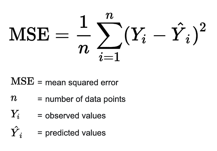

Figure 30 shows you how to apply MSE and our model MSE is 0.015. It is a good value and it can be concluded that our model performs well in the testing phase.

Figure 31 shows you graph representation for actual vs predictions. The above graph show only for first 200 data points in the testing data frame. So, we can see our model captured the general pattern well in also testing phase.
We can also use the K-cross-validation technique to measure our model accuracy.
Read more about K-cross-validation.
Our model gives approximately 98.5% accuracy after K-cross-validation. Here I substitute K with 5 and use 5 cross-validations. Figure 32 shows you how to do K-cross-validation at the coding level.

Summary
Our linear regression model has been achieved approximately 98.5% of greater accuracy and it also performed well in the testing phase. And we use 4 dimensions for our model from significant features we identified in the feature engineering section. Those significant features for our target variable are Temperature, Visibility, Humidity, Precip Type, and Pressure.
Now we can answer our use case, The first question is there a relationship between humidity and temperature? The answer is Yes. We can clearly see it from figure 23. But, that is not a strong relationship. but it has a considerable amount of negative relationships. It is nearly -0.6. The second question is What about humidity and apparent temperature? The answer is humidity and the apparent temperature has a negative correlation same as the humidity and temperature. But, it is also not very much strong relation. The last question in our use case is Can you predict the apparent temperature given the humidity? The answer is yes. we can predict apparent temperature when given humidity. because there is an approximately -0.6 negative correlation between humidity and temperature. But, if we only use humidity, then our bias term (intercept in our linear regression) will be increased. So, it will lead to under-fitting our model. It clearly shows you in figure 33. And also, if we use all the dimensions or features for the model then, our model will lead to over-fitting. Because it gives a high variance and low bias. This problem is called a Bias-Variance Tradeoff. Therefore, four dimensions are enough to predict apparent temperature without over-fitting or under-fitting.

Python Notebook — https://github.com/amesh97/machine_learning
Thanks for reading …..
